

Cloud-based web and mobile
From brick-and-mortar, e-commerce, and everthing in between, product management workflow has been a universal challenge for all businesses. Our goal was to refine the products that enables these players to participate together with
optimized workflow and maintain effecient product lifecycle. PlumSlice Labs had a SaaS concept executed, and they have come to us to refine them, establish a brand identity and apply them throughout their products and collaterals.
Project Overview
Hi-Fidelity Collaboration
Vast architecture clarified by collaborating with client and multiple iterations after working sessions.

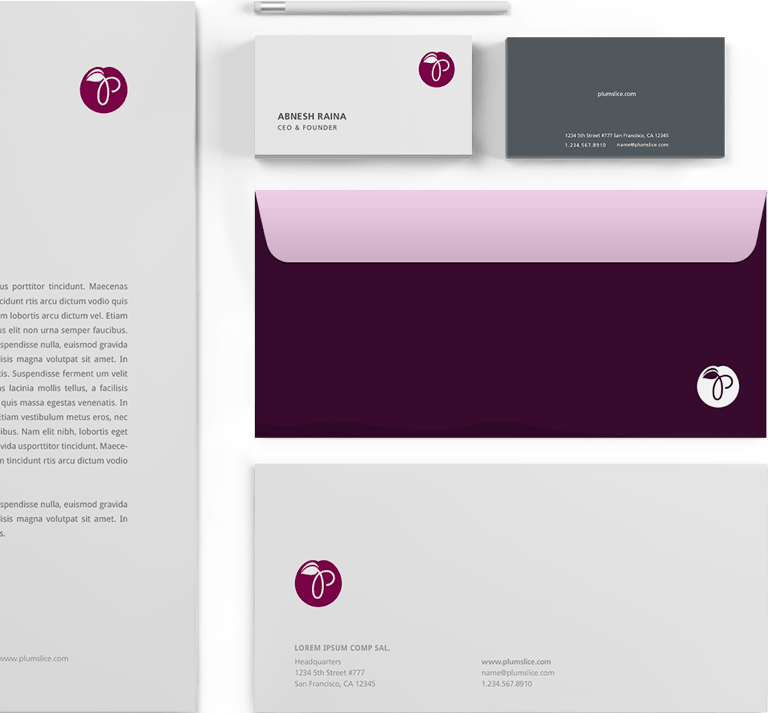
Brand Refinement
Conducted a logo study and color swatches, established a styleguide to be used throuout the various PlumSlice products.
Multi-Platform Apps
Improved the UI/UX and Visual design of the existing desktop web app and extended the experience to mobile.
Test & Launch
Partnered with new developers and coordinated QA session in a short timeframe until launch.
Rapid Iterations
Highly Engaged Working Session
Working Session with our client was crucial in order to construct the base of the platform. With multiple user roles and customizable attributes throughout 4 modules, we ran through the collaborating user stories and iterated a high definition
Interviews with Industry Veterans
prototype to clarify each interaction goals. After simulating through multiple UX flows and testing component behaviors, our team delivered a full follow-through wireframe for individual modules. Selected concept was translated over to the mobile version later phase of this project.
Refining Brand Identity
The Friendly Plumslice
Creating mockups with designers is one thing, but translating it to code with developers is another. Working closely with the development team is crucial in order to get all the details tocome out the way they’re supposed to. This project was broad in terms of browser support. We conducted unit testing on the latest versions of Chrome, Firefox, Safari, as well as, Internet Explorer 8 and 9.
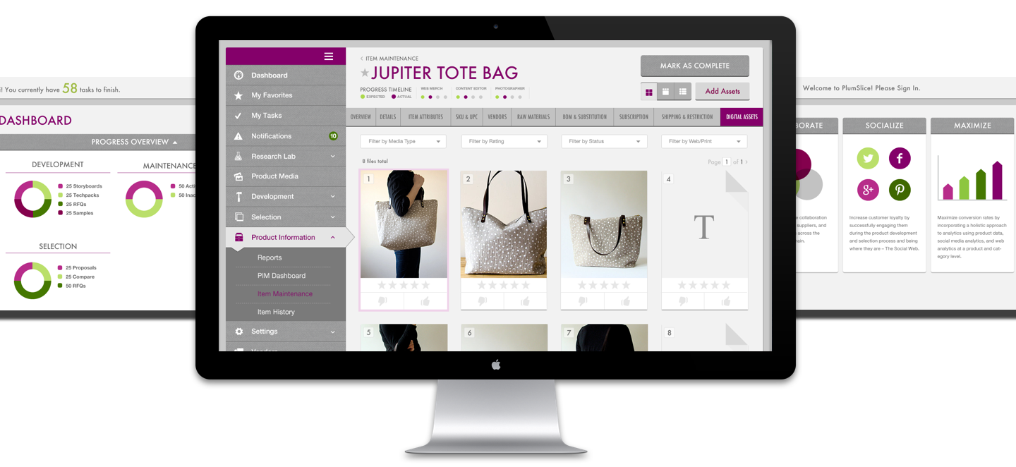
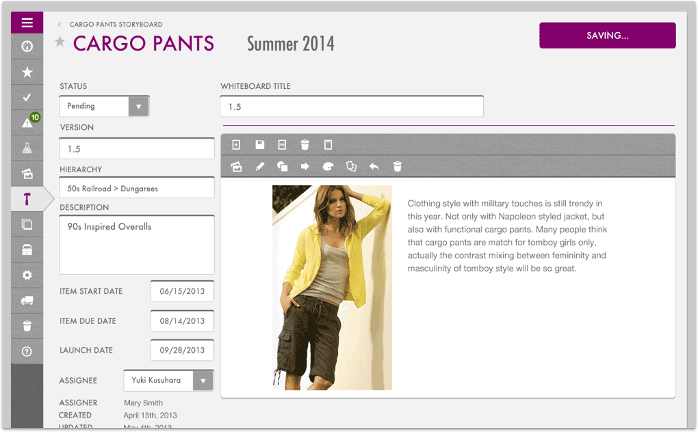
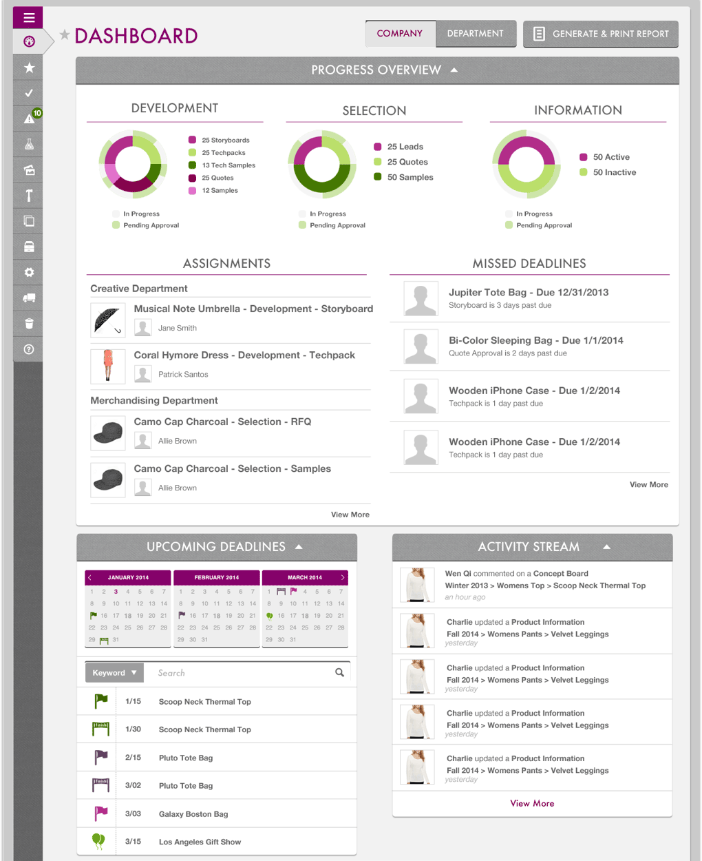
The Desktop Web App
Approachable but Focused Design
for Maximum Productivity
We heard from our inductry veterans about how the day goes in the office, and it is overwhelming: tens and thouusands of vendors to buy merchandise from, allocate in-house designers and chase the status of a product, connecting with third party
warehouse to see which pants, which length, which color is low in stock. We took this opportunity to establish the brand principle for PlumSlice and utilize them to emit a comforting but motivating enerygy through design. With subtle texture and accent colors, users are
guided through the flow as they accomplish their goals. The principle was adopted throughout the app and the collaterals.
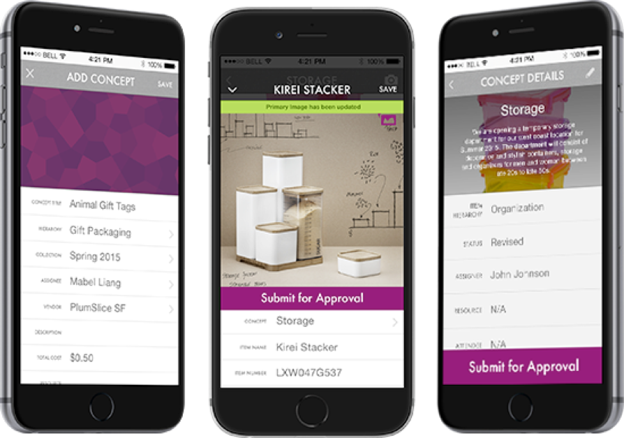
The Native Mobile App
Approachable but Focused Design
for Maximum Productivity
We heard from our inductry veterans about how the day goes in the office, and it is overwhelming: tens and thouusands of vendors to buy merchandise from, allocate in-house designers and chase the status of a product, connecting with third party
warehouse to see which pants, which length, which color is low in stock. We took this opportunity to establish the brand principle for PlumSlice and utilize them to emit a comforting but motivating enerygy through design. With subtle texture and accent colors, users are
guided through the flow as they accomplish their goals. The principle was adopted throughout the app and the collaterals.
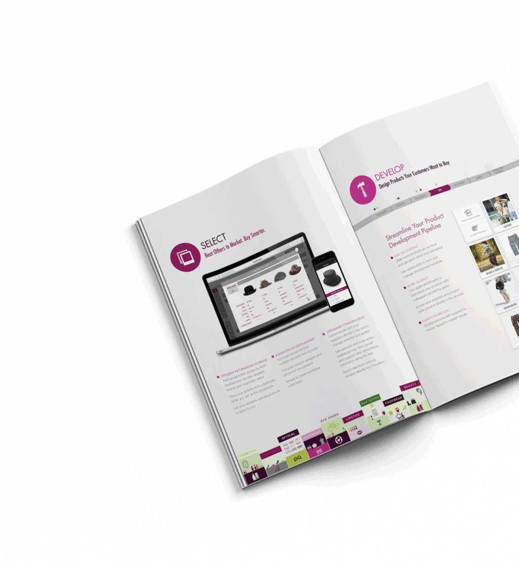
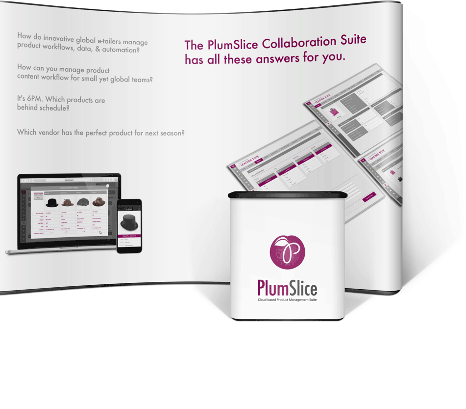
Marketing Collateral
We will take care of you all the way!
Creating mockups with designers is one thing, but translating it to code with developers is another. Working closely with the development team is crucial in order to get all the details tocome out the way they’re supposed to. This project was broad in terms of browser support. We conducted unit testing on the latest versions of Chrome, Firefox, Safari, as well as, Internet Explorer 8 and 9.
Heading
We came across some performance issues in several parts of the site, mainly in the search results. With so much information, it was hard for the site to pull all the data in a quick manner. We worked with the developers and optimized the search results load time to better serve B/E’s customers.
In Retrospect
How the Launch Went
Creating mockups with designers is one thing, but translating it to code with developers is another. Working closely with the development team is crucial in order to get all the details tocome out the way they’re supposed to. This project was broad in terms of browser support. We conducted unit testing on the latest versions of Chrome, Firefox, Safari, as well as, Internet Explorer 8 and 9.
We came across some performance issues in several parts of the site, mainly in the search results. With so much information, it was hard for the site to pull all the data in a quick manner. We worked with the developers and optimized the search results load time to better serve B/E’s customers.
How the Product we developed for PlumSlice Continue to Help People
Voki came to us and wanted our team to design the look and feel of their native phone app. Our initial conversations were over design aesthetics and how we could create a light, airy, and emotional interface to reflect the brand.
The first thing that popped into our minds was bokeh photography because it blurs images that are pleasing to the eye. Since this was going to be a messaging application, it’s helpful for the user to focus on the content and not the background.


