FirstHandle
UX Redesign Captures New Audiences
Revamping the UX to increase downloads and drive up user engagement for a local deals retail shopping app


Revamping the UX to increase downloads and drive up user engagement for a local deals retail shopping app

Competitive analysis of local deal shopping apps, adding features to increase user engagement and social sharing

Optimize for users who may be out and about; geofenced notifications will let them know if there is a great deal nearby

Simplify existing flows and enhance hierarchy so that users have the most relevant UI controls on hand

Strenuous testing on iOS and Android devices to ensure technical flawlessness and polished final designs
FirstHandle offers geolocation-based coupons to shoppers that they can collect and redeem in local stores.
With several competing apps in that space, FirstHandle approached us with a desire to increase its market adoption and improve its coupon redemption rates. The app gained an initial user base of male techie early adopters, but the company wanted to expand to female shoppers, who they felt would represent a substantial growth opportunity.
The challenge was to capture this new demographic without alienating the current one, while simultaneously improving coupon redemption rates.
We began by understanding the current user base of mostly male early adopters, then focusing on gaining a deep understanding of the new target user base of middle-class females aged 25-45.
We examined what apps they use, both for local shopping deals and for general use. Our survey of competitive apps yielded an array of useful insights into what works well, what doesn’t, and what was missing completely.
Collating this research resulted in a catalog of recommendations for a new UX, strengthening the parts that were working, removing those that weren’t, adding a few new features, and creating a roadmap for potential future features.
Showing relevant, interesting offers to users at the right time and place is one of FirstHandle’s value propositions, so we optimized the app to be easy to use when users are out and about.
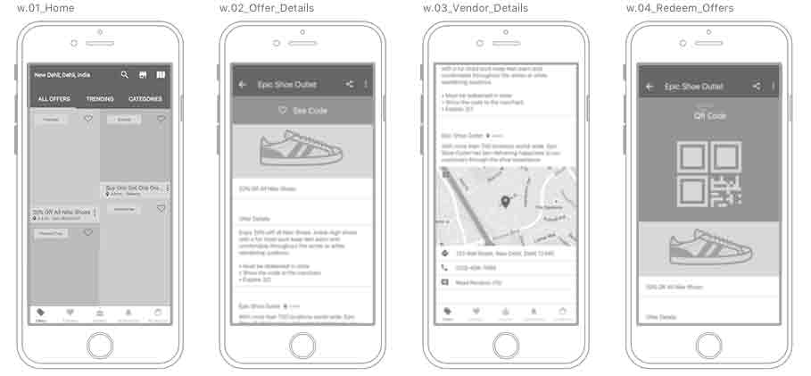
Since location is key, we added an integrated map view so users can easily see discounts near them and where to go to redeem the offer right now. But for users who aren’t ready to buy, we also made coupon codes easy to save and and recall for later redemption. Striking the right balance for notifications is always a challenge, and everyone has a different tolerance level for them.
We added the ability to customize the frequency of push notifications to avoid annoying users, while also allowing users in “shopping mode” to be maximally aware of any offers nearby.
Another key aspect is the context of usage: the app is used most frequently during periods of shopping, which means that users are likely to have their hands full of shopping bags. Big hit areas and a vastly simplified flow to redeem coupons reduces user frustration in real world usage scenarios.
Shopping should be fun and exciting, and the design needed to reflect and encourage those emotions.
Furthermore, the visual design of FirstHandle needed to be fresh, exciting, and cheerful to promote the concept that fresh new deals were available to be discovered each day.
Our bright and clean palette strikes the right emotional tone, with a distinctive look. Selective use of color reinforces hierarchy and provides cues for interactive elements. The principle accent color of bright amaranth red hints towards pink while being bright, energetic and active, but stays safely far enough away from actual pink to avoid alienating of male audiences.

Shourya Magotra
Product Manager, First Handle


